The goal
Reduce checkout abandonment by putting trust signals at the exact moment doubt creeps in — the payment step. Most stores scatter trust badges across product and cart pages. The problem with that: the doubt that actually loses the sale ("is this legit? what if it doesn't fit? what's the return situation?") peaks at checkout, when the customer is about to hand over money. That's where the reassurance needs to be.
What the customer sees — in the real Shopify checkout

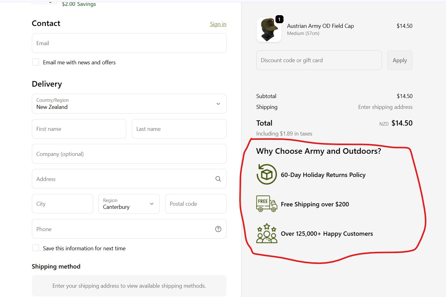
Here it is in context: the trust block sits in the Shopify checkout, directly under the order summary, right next to the payment action. Not buried on a product page they've already left behind.
Close-up of the three signals:

Why these three signals
The three weren't chosen at random — each answers a specific checkout-moment objection:
- 60-Day Holiday Returns Policy — risk reversal. The single biggest unspoken objection at checkout is "what if this is wrong / doesn't fit?" A generous, clearly stated returns window removes that fear at the moment it's loudest.
- Free Shipping over $200 — does double duty. It's a trust signal (transparent shipping terms) and a subtle AOV nudge — a customer near $200 has a reason to add one more item before paying.
- Over 125,000+ Happy Customers — social proof. "Lots of people have done this safely before you" is one of the strongest conversion levers in existence, and it's most persuasive right before the commitment.
How it was built — honestly
Same honesty as the MCP server and the mystery-gift extension elsewhere on this site: this was built using Claude. I decided what mattered — that trust signals belong in the checkout not the product page, and which three signals to use and why — and directed Claude to build the Checkout UI Extension, then shipped it live.
This one was genuinely simple — static trust content, no API calls, no threshold maths or state guards. The engineering was never the hard part here. The value was the decision of what to show and where, which is mine. The build itself, I'm not going to dress up as something it wasn't.
Where the work genuinely needs deep hands-on engineering — the multi-store sync, the webhook reliability patterns, the years-stable production systems in my other case studies — that's hands-on work I've done and own. Where modern tooling ships something faster and cheaper, I use it and I tell you. That honesty is the point.
Honest about the result
Trust badges at checkout are a well-documented conversion lever — there's a large body of CRO research behind the mechanic. But I'm not going to quote you a conversion-rate uplift percentage for this specific implementation, because I don't have a clean, isolated A/B measurement of it in front of me. Quoting a number I can't attribute would undermine every other number on this site.
What's true: it's live in the Army & Outdoors checkout, it costs nothing in performance, and the placement (checkout, not product page) follows what the CRO evidence actually supports. The honest expectation is "this is a low-risk, well-supported conversion lever on Plus" — not a guaranteed figure.
Why this matters for your store
If you're on Shopify Plus and your trust signals stop at the product page, you're reassuring customers before they've decided and going silent at the moment they actually hesitate. The checkout is the highest-stakes, most under-used real estate on a Plus store — most merchants don't realise they can put anything there, so they don't.
Putting the right three signals there — risk reversal, transparent terms, social proof — is a small, low-risk build with a well-evidenced upside. It's the kind of thing that should already be done and usually isn't.